
Elementor Widgets in PASS Addons
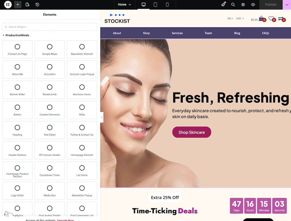
PASS Addons comes with over 70 Elementor widgets, allowing you to build complex layouts and functional pages using the Elementor page builder. Each widget is structured to provide flexibility, control, and simplicity, even for beginners who have never used Elementor before.
Getting Started with PASS Addons Widgets in Elementor
When you work with our PASS Addons widgets in the Elementor editor, you’ll notice that all widgets share a consistent structure. This makes it much easier to customize your content and ensures a unified look across your website. Once you become familiar with one widget, you’ll quickly feel confident using all the others!
Within the content tab, each widget is divided into several main sections that help you control both the content and appearance. These sections include Layout, Heading, Content, Settings, Structure, and Edit Widget Data. Let’s explore each section step by step so you know exactly what to do.
Layout
The Layout section determines how your content is displayed on the page. You can choose different display types such as grid, slider, or list. This section is like the “skeleton” of your widget because it defines the overall structure and flow of your content.
- Grid Layout: Displays your items in neat rows and columns.
- Slider Layout: Allows visitors to scroll through items horizontally.
- List Layout: Shows content in a simple vertical list format.
Tip: Start with a simple layout and experiment to see which format looks best for your content and design.
Heading
The Heading section lets you add headings and subheadings directly inside the widget. This is convenient because you don’t need a separate heading widget, keeping your design simple and consistent.
- Add titles for sections of your content to make them easy to read.
- Customize font size, style, and alignment to match your site’s look.
Tip: Use clear and concise headings to guide your visitors’ attention.
Content
The Content section controls what your visitors actually see. For example, if you are using a Post Archive widget, you can choose to show or hide post excerpts, read-more buttons, author names, and other details. This section allows you to decide exactly which elements appear in your widget.
- Turn elements on or off depending on what’s important.
- Ensure content is engaging and easy to read.
Tip: Focus on showing the most important information first, so visitors quickly understand your content.
Settings
The Settings section controls the database queries that determine which content is displayed in the widget. For example, you can:
- Set the number of posts or items to show.
- Filter content by categories or tags.
- Display only certain types of posts or custom content.
Tip: This is the section to manage dynamic content. Make sure your filters match what you want your visitors to see.
Structure
The Structure section affects the visual layout and spacing of your widget. Here, you can adjust padding, margins, width, and color schemes to make your content look polished and consistent across all pages.
- Adjust spacing to prevent content from looking cramped or too spread out.
- Use colors and styles that match your website’s theme.
Tip: Small adjustments in spacing and style can make a big difference in the overall design.
Edit Widget Data
If a widget relies on content stored in the database, the Edit Widget Data section provides links to add or manage that content. For example, a Post Element widget will let you:
- Add new posts or pages.
- Manage categories and tags.
- Update content without leaving the Elementor editor.
Tip: Keeping your content up-to-date here ensures your widgets always display fresh and relevant information.
By following this step-by-step guide, even beginners can confidently use PASS Addons widgets in Elementor. The consistent structure across all widgets—covering Layout, Heading, Content, Settings, Structure, and Edit Widget Data—makes editing simple, intuitive, and enjoyable.
Style Tab
The Style tab is generally divided into Layout, Heading, and Content sections:
- Layout: Adjust spacing, background colors, and overall visual structure.
- Heading: Customize typography, color, and spacing for headings and subheadings.
- Content: Style buttons, text, spacing, and other inner content elements.
